how to make party signage (part 1)
As an Amazon Associate I earn from qualifying purchases.
 One of the most frequently asked questions in our kojo inbox (besides Can I pay you to make me an Anthro-inspired quilt/Everything Bag?) is How do you make your party signage (or party printables, or party labels, or cupcake toppers, etc.)?
 The short answer is that, through a process of trial and error, we now have a system and some handy templates that we customize for pretty much every party we throw.
But that’s not helpful to you, our friends, who are trying to replicate this process, hopefully minus some of the trial and error part.
And that’s where this series comes in- we’d love to share what we’ve learned about putting together the signage or printables for a party over the course of a few how-to posts.
 Today, we’ll cover a few basics of party sign making– the program(s) we most frequently use for design, where we find our fonts and how we make/find our graphics.
In the rest of the series, we’ll chat about how to make your own customizable templates, as well as tips for designing invites, cupcake toppers, food labels, water bottle wraps and other party labels. By the end of the series, you should be armed and ready to take on the signs for your next party.
First, let’s chat about fonts. We are font junkies, for sure, and love utilizing our massive stockpiles of free fonts to gussy up our party printables. A few terrific sources for (mostly) free fonts?
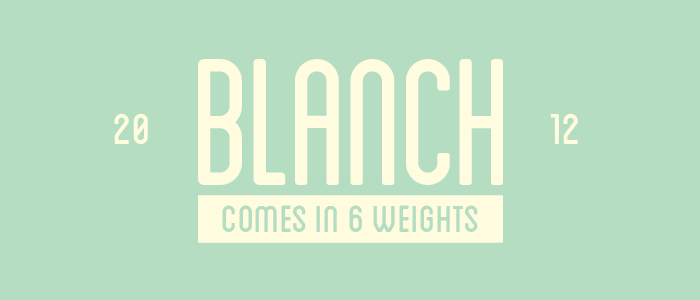 Lost Type Co-op (Blanch, above, is from Lost Type Co-op- fabulous!)
dafont (the only drawback to this site is the sheer quantity of fonts to sort through)
Fontsquirrel (all of these fonts are free for commercial use as well)
fontspace (their fonts are categorized by keyword- I wish every font site would follow suit)
We usually use two or three fonts per ‘party suite’- and tend to pair a more basic font with a scripty font for our designs. We repeat the same fonts over and over again for all of the signage for a cohesive look.
 Once we’ve found a couple of fonts that match the mood of the party, we move on to graphics. Let me tell you a secret- our go-to source for party sign graphics? Fonts. Dingbats, to be more specific. That little heart from Piper’s Sprinkle Party signage? It’s the letter “p” in WC Sold Out A Bta. Or the cutest-little-bike from Hazel’s Bike Party signage? It’s the letter “A” in WC Sold Out D Bta (all of the WC fonts are gold mines for cute graphics actually).
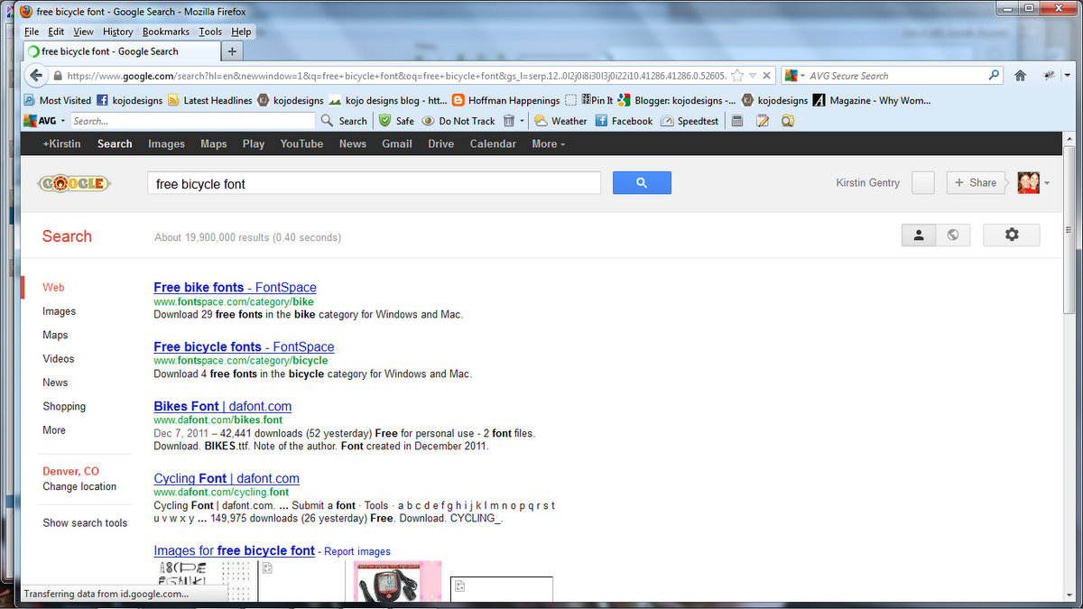 In fact, at the very beginning of my party-signage-design process, I start by googling “free bicycle font,” just to see if I can find a font with the graphic that I’m looking for (substitute your party theme in for ‘bicycle,’ when you try this, of course).
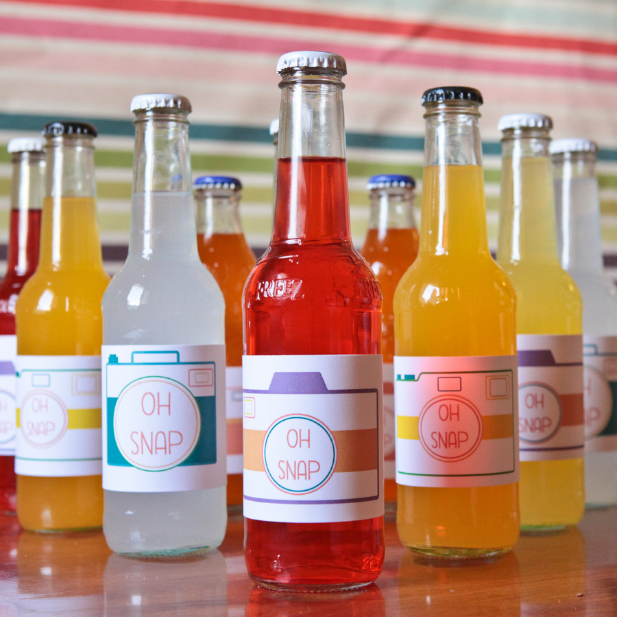 It also doesn’t hurt to have a graphic designer as a sister (for example, Jord was the genius behind all of the “Pop” graphics for the Ready to Pop baby shower, and she made all of the vintage-y cameras for the Oh Snap! party). If you have access to a graphic design savvy friend, and they’re up for helping you, graphic designers are great party-signage resources (be sure to offer to pay them for their work!).
This brings us to our last party sign design basic- programs. Since both of us prefer to work in Photoshop, lots of our design happens there. And though Photoshop is expensive (and not super intuitive), the freedom to modify and customize that Photoshop provides makes it our design go-to. However, our other favorite program is Microsoft Powerpoint! Just by messing with all of the options in WordArt (the little crooked “A” found under the ‘Insert’ tab), you have a whole repertoire of font and graphics modifications at your fingertips. Plus, once you create a basic ‘party signage’ template in Powerpoint, you can use it for every party.
 Stay tuned for more Party Sign Design how-to’s… Also, do you have any free font or graphic sources? Which programs do you use most frequently?


Oh, you are such a tease! HA. I was hoping that you’d spill all your awesome secrets/tricks in one post and I have to endure a series? (Brilliant on your part, but patience isn’t one of my finest qualities!)
I will try to remain calm, as I know this is gonna be worth the wait….in the mean time, I will be downloading more fonts.
I laughed out loud when I thought about trying to put it all in one post (it’d be the longest.post.ever!). The good news is that downloading fonts is so fun! 🙂
ps- I want to make sure your hopes aren’t too high for the posts to come- a lot of it is figuring out what you need, making templates that you can use over and over (which you could start now, really- just start messing around in Powerpoint). 🙂
This is a great series idea!! Thank you for doing this!!
Thanks Meg!
Hi! I absolutely love your bicycle party pictures and I am trying to replicate the invitation for my son’s party. When I increase the font size of the bike/font you recommended it becomes very pixely (for lack of a better word). The edges are not smooth and you can see the pixel lines. Did you have this happen? If so, would you mind sharing how you fixed it. Any help would be appreciated! Love your website….so cute.
Hey Carine, totally understand what you’re saying, but have no idea why that’s happening to you! We used really big bikes on the ‘cereal and milk’ and ‘favors’ signs (as well as all of the specific favor labels) and the bikes didn’t pixelate. So weird! You could search for another bike font, perhaps?
Hope that helps friend!
ps- If you can’t figure it out, the bike printables are in the etsy shop now as well… kojodesigns.etsy.com.